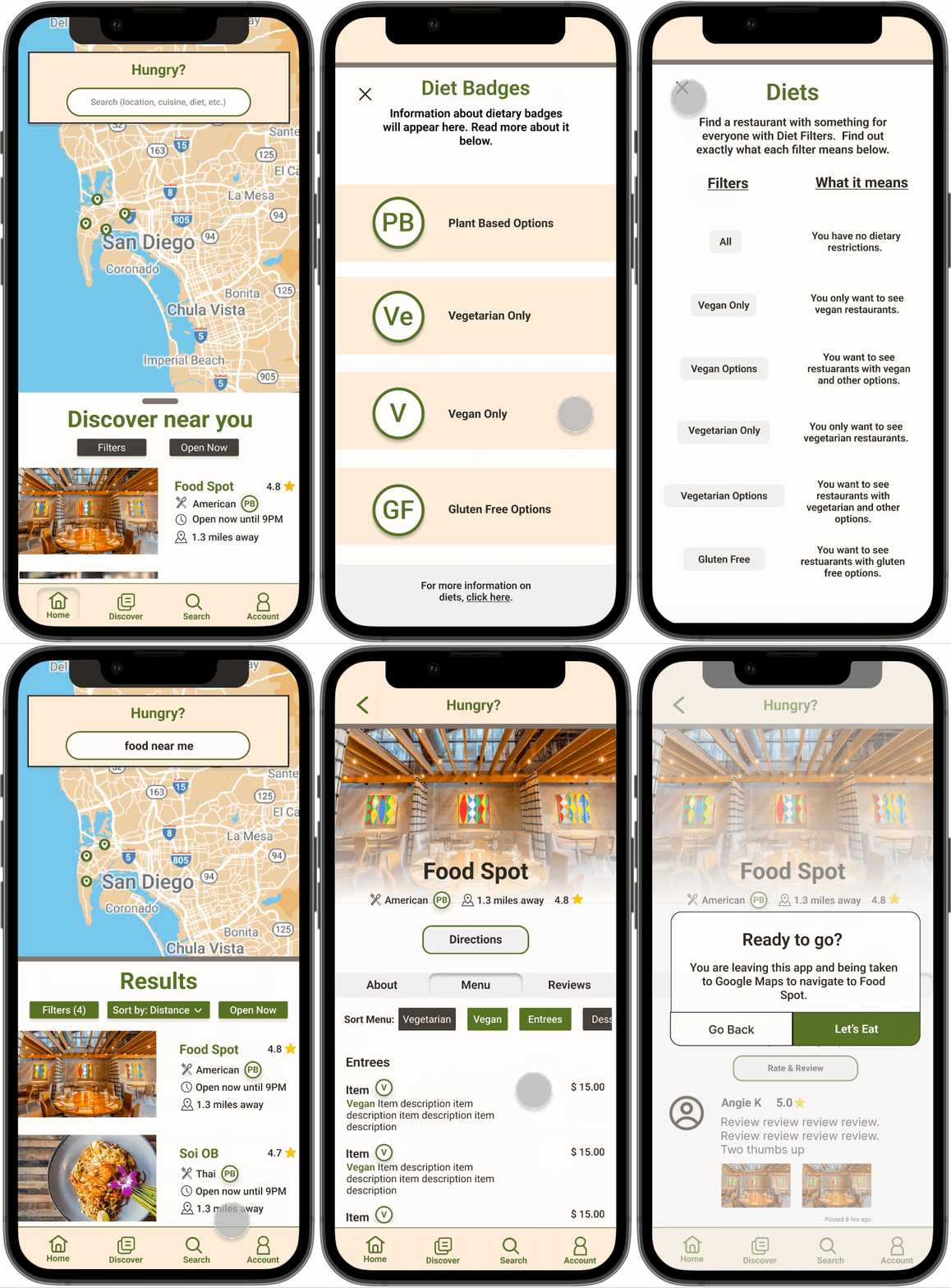
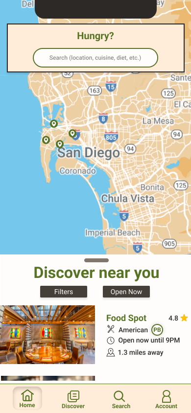
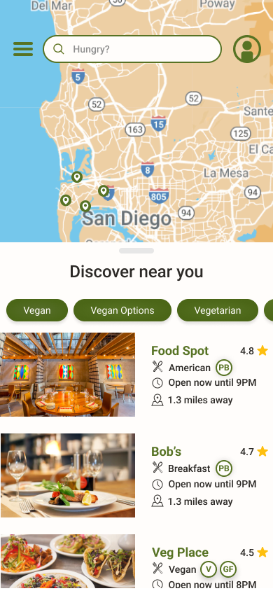
Mobile app screen showing a map of San Diego with restaurant locations marked, a search bar for food-related queries, and a featured American restaurant called "Food Spot" with a 4.8-star rating, open until 9 PM, located 1.3 miles away. Navigation icons for Home, Discover, Search, and Account are at the bottom.

Case Study: Hungry App

Hungry App was my first ever UX project, and is displayed here as a testament to how I have grown (and continue to grow) as a designer. It provides a valuable look into my humble beginnings, and is a concept I am still passionate about - providing accessible food options for those with dietary restrictions!

My Role

End-to-End Designer

Goal

Provide an uncomplicated restaurant search engine that gives users all the information they need to make the best decision as painlessly and efficiently as possible.

Project update!

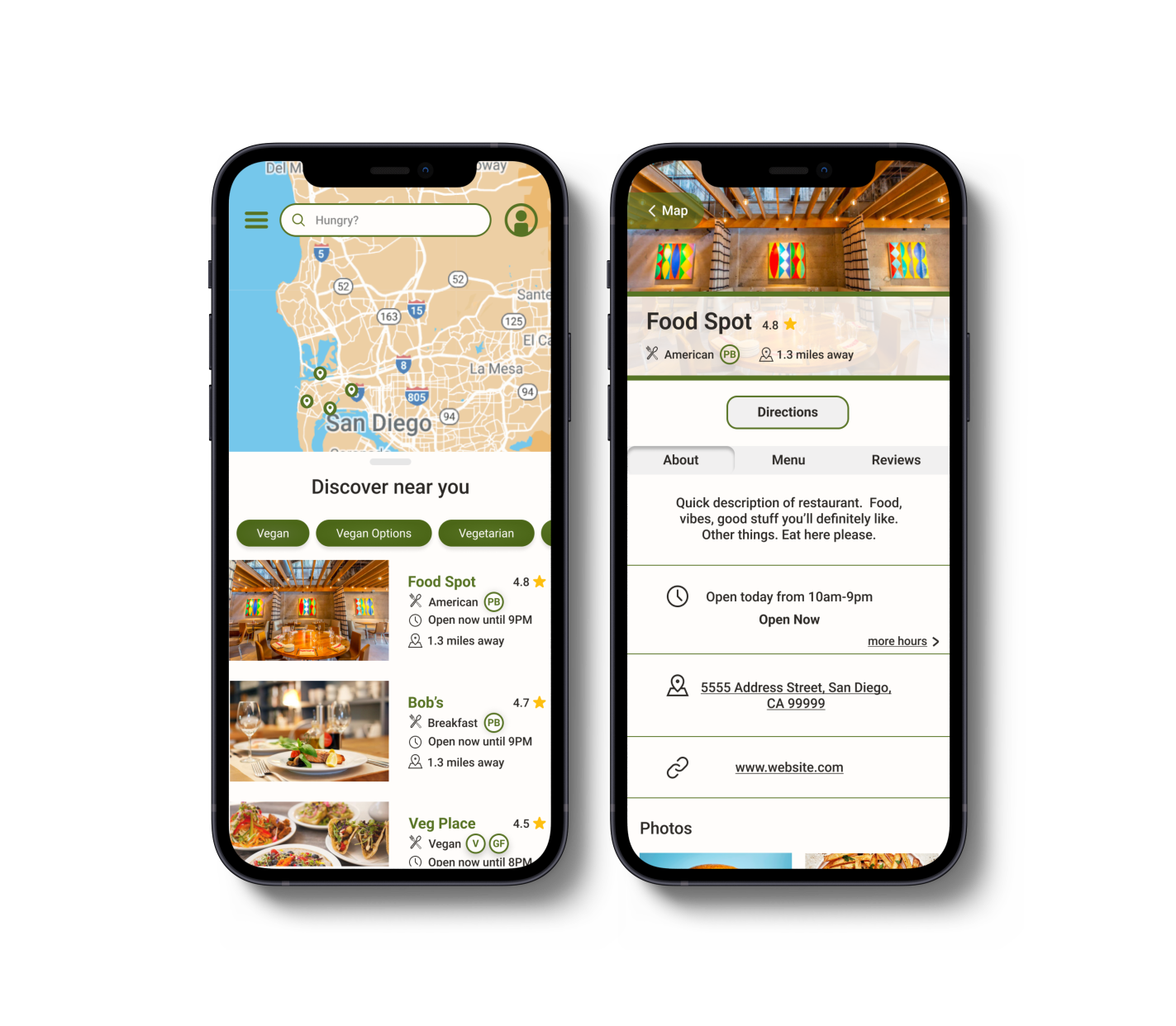
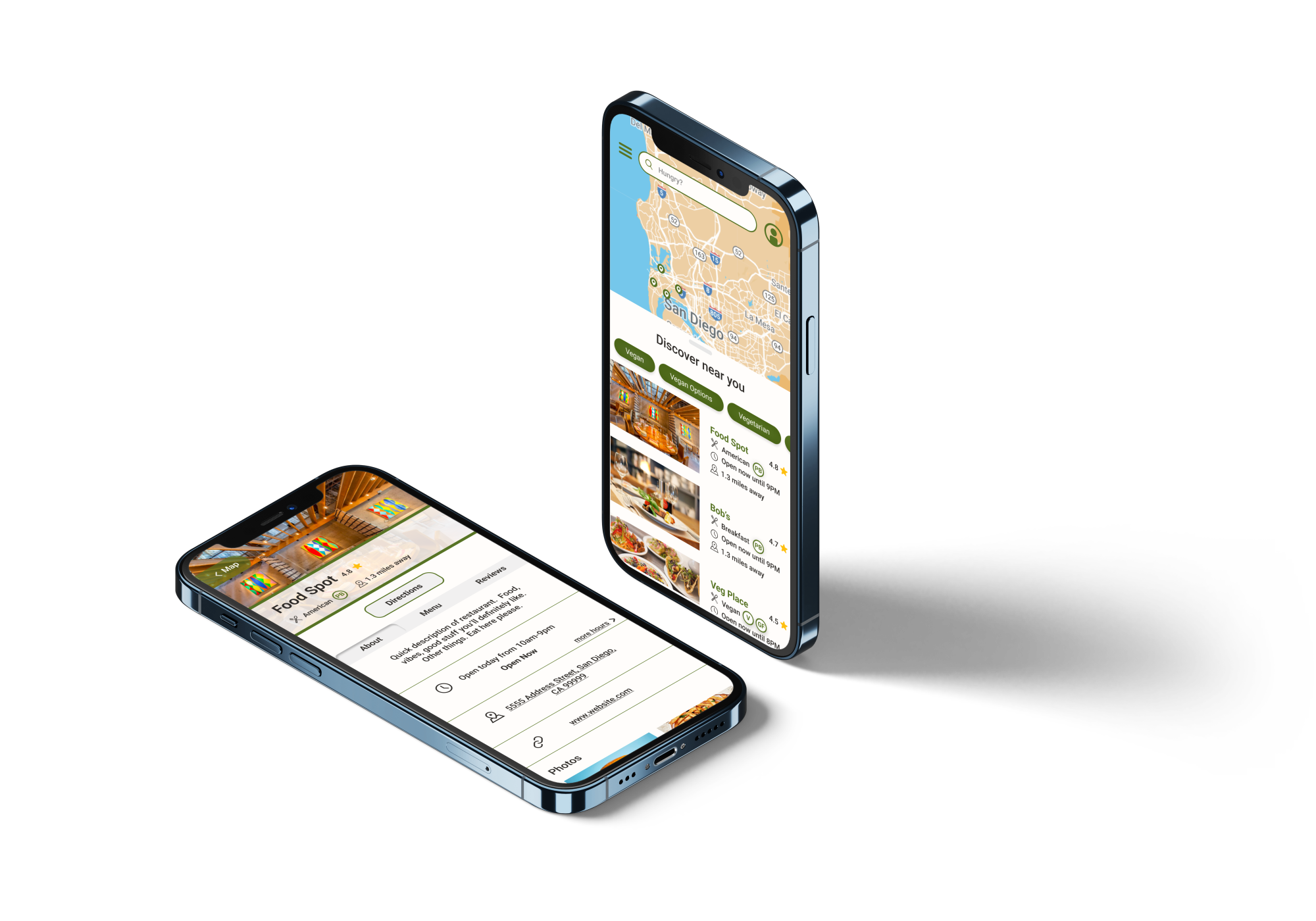
These screens are a constant work in progress! To the right, you can see the most updated version of the screens, which are not yet represented in the prototype. Updates include:

  • Polished UI

  • Cleaner organization of information that is easier to digest

  • New dietary badges

  • More rounded corners - less borders

  • Updated navigation style

Two smartphones displaying a restaurant discovery app interface. The left phone shows a map of San Diego with restaurant options listed below featuring tags like vegan and vegetarian. The right phone displays details for "Food Spot," including ratings, a description, opening hours, address, and website link.

The Problem

  • People following restrictive diets feel isolated and burdensome with a fear of being judged

  • -People sharing a meal with those following a different diet than their own also fear being judged or unable to accommodate the other person. 

  • The top search engines for restaurant searches are Google at #1, followed by Yelp, and HappyCow for people following plant based diets. These search engines are providing incomplete or unreliable information for those who don’t follow a standard diet.

Interviews

Considering these problems, I decided to conduct interviews to gather primary accounts of these experiences.

First, I identified the major types of people who exist in this problem space:

  • Those following any restrictive diet

  • Those who spend time with someone on a restrictive diet.

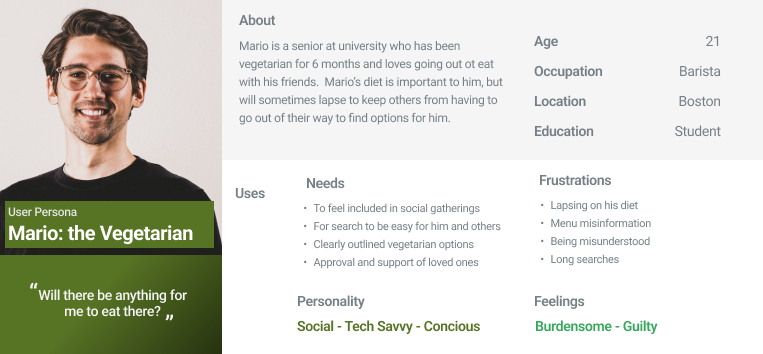
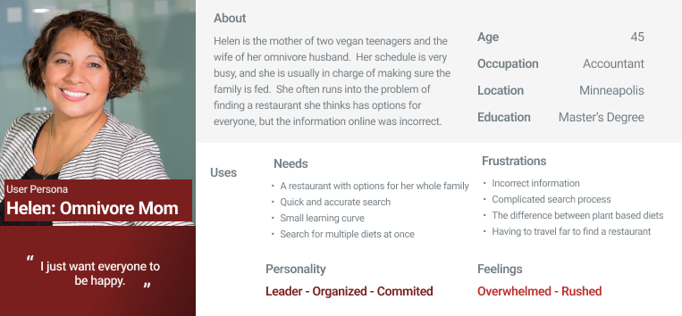
I created two personas to represent these groups for my own reference, as well as the reference of my stakeholders.

User persona profile for "Mario: the Vegetarian." Includes Mario's personal details, needs, use cases, frustrations, personality traits, and feelings related to his vegetarian lifestyle. Information highlights Mario's age, occupation, location, and education.
Profile of "Helen: Omnivore Mom," a user persona. She is 45, lives in Minneapolis, and is an accountant with a master's degree. Helen is a mother of two vegan teenagers and married to an omnivorous husband. Her needs include finding restaurants catering to various diets and quick, accurate searches. She is described as a leader, organized, and committed, feeling often overwhelmed and rushed due to complicated search processes for suitable restaurants.

Based on these personas and the information gathered so far, I used a screener survey to narrow down participants. I was able to find 6 people that met the following criteria:

  1. Either has a dietary restriction, or regularly eats with someone who does

  2. Uses the internet to search for new restaurants 

  3. Goes out to eat at least once a month 

  4. Has had the experience of finding a restaurant for a group of people with multiple dietary needs


Key takeaways from my interviews included: 

- The plant based participants use search engines much more frequently than those following a standard diet. 

- Many of the participants expressed frustration when they spoke about their experiences searching for a restaurant for everyone, specifically regarding how much time it can take. 

- One participant who has been vegan for years passionately voiced her desire for an icon to quickly notify her whether there will be options for her or not before she begins scanning a menu. 

Synthesize and Organize

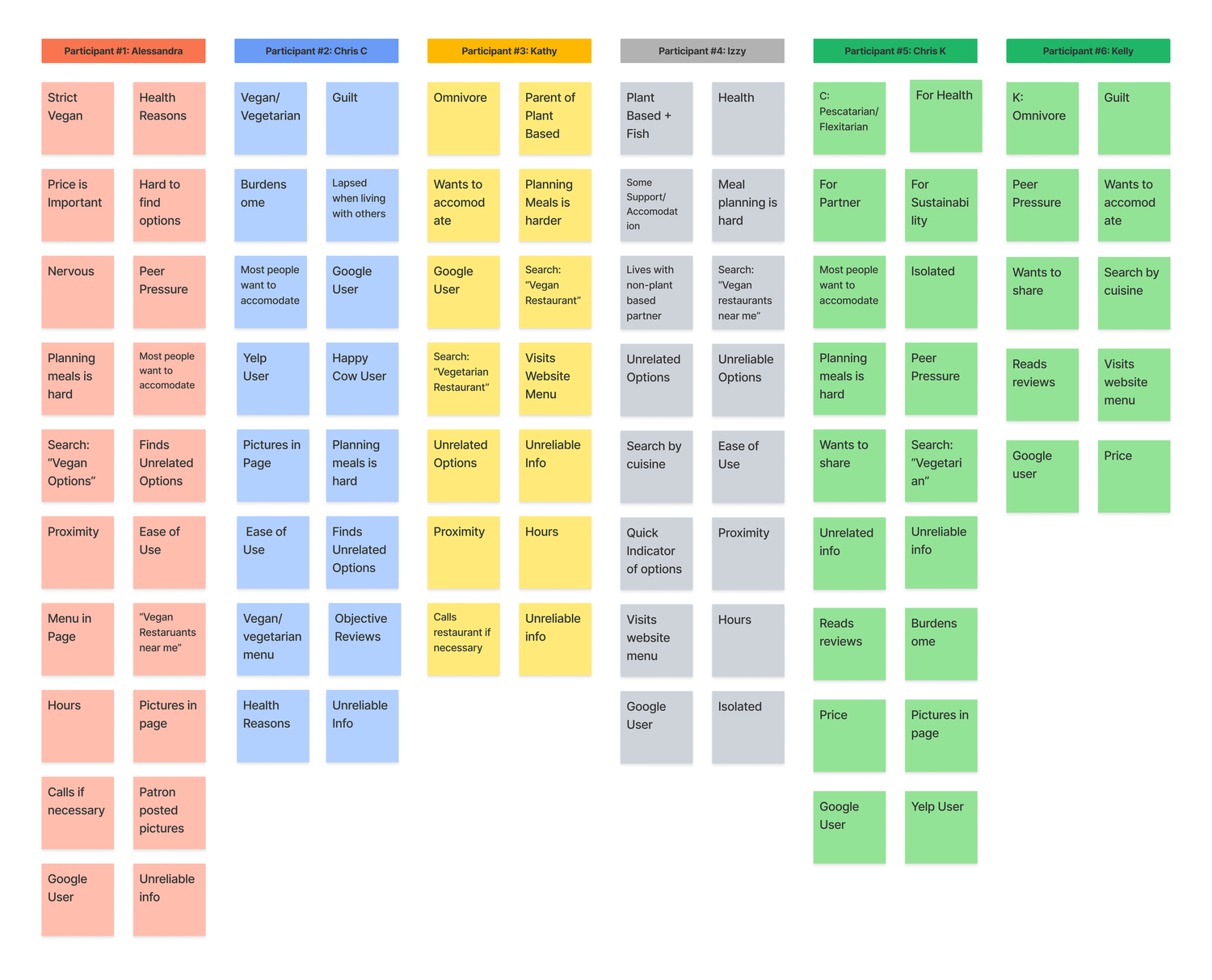
1. I extracted themes from each interview, represented them with codes, and organized them by participant 

A chart displaying responses from six participants about their dietary preferences and decision-making processes related to eating out. Each participant is represented by a different color block and lists factors such as 'Health Reasons,' 'Vegan/Vegetarian,' 'Omnivore,' 'Proximity,' and 'Ease of Use.' Common themes include 'Price,' 'Google User,' and 'Unreliable Info.'

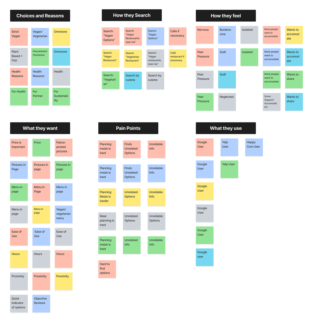
2. Common themes among participants were identified and codes were sorted into corresponding categories 

Diagram showing various categories related to dining choices and behaviors, including 'Choices and Reasons,' 'How they Search,' 'How they Feel,' 'What they Want,' 'Pain Points,' and 'What they Use.' Each category contains colored boxes with text like 'Vegan/Vegetarian,' 'Nervous,' 'Price is Important,' 'Planning meals is hard,' and 'Google User.'

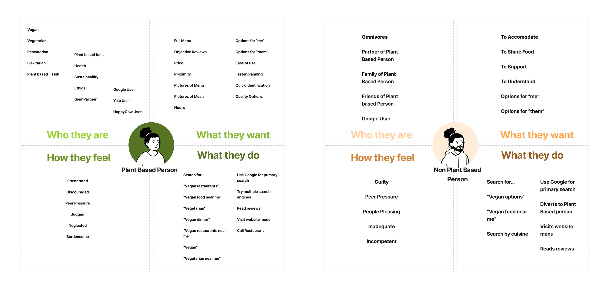
3. To ensure a user-focused approach, themes were taken into the context of the user in empathy map format for each group

Comparison diagram outlining characteristics of plant-based and non-plant-based individuals, including who they are, how they feel, what they want, and what they do. Plant-Based Person feels frustrated and searches extensively for vegan options. Non-Plant-Based Person feels guilty and accommodates plant-based diets.

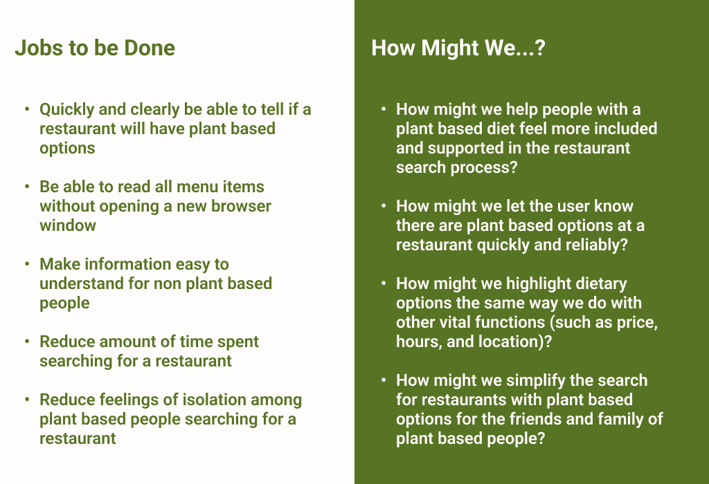
4. ‘Jobs to be Done’ and ‘How Might We?’ Statements were created to focus on the problem solving stage of the project

Text comparing "Jobs to be Done" and "How Might We...?". "Jobs to be Done" includes goals like identifying plant-based restaurant options and reading menus easily. "How Might We...?" questions ways to improve plant-based dining search experiences, such as inclusion and dietary option visibility.

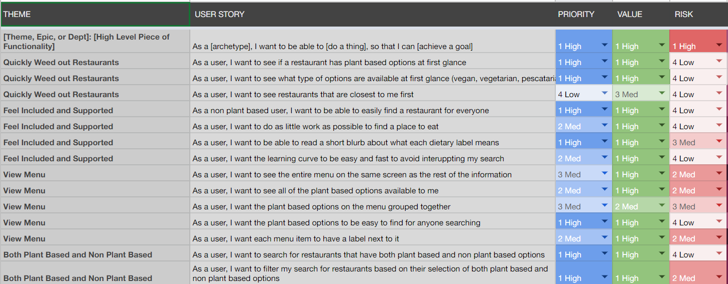
5. User Stories were created to combine user focused design with problems that needed to be solved. 

Table displaying user stories related to restaurant search features, including themes, priority, value, and risk levels, with color-coded categories.

6. Red Routes were identified and User Flows were established as a starting point for the design process.

Design Evolution

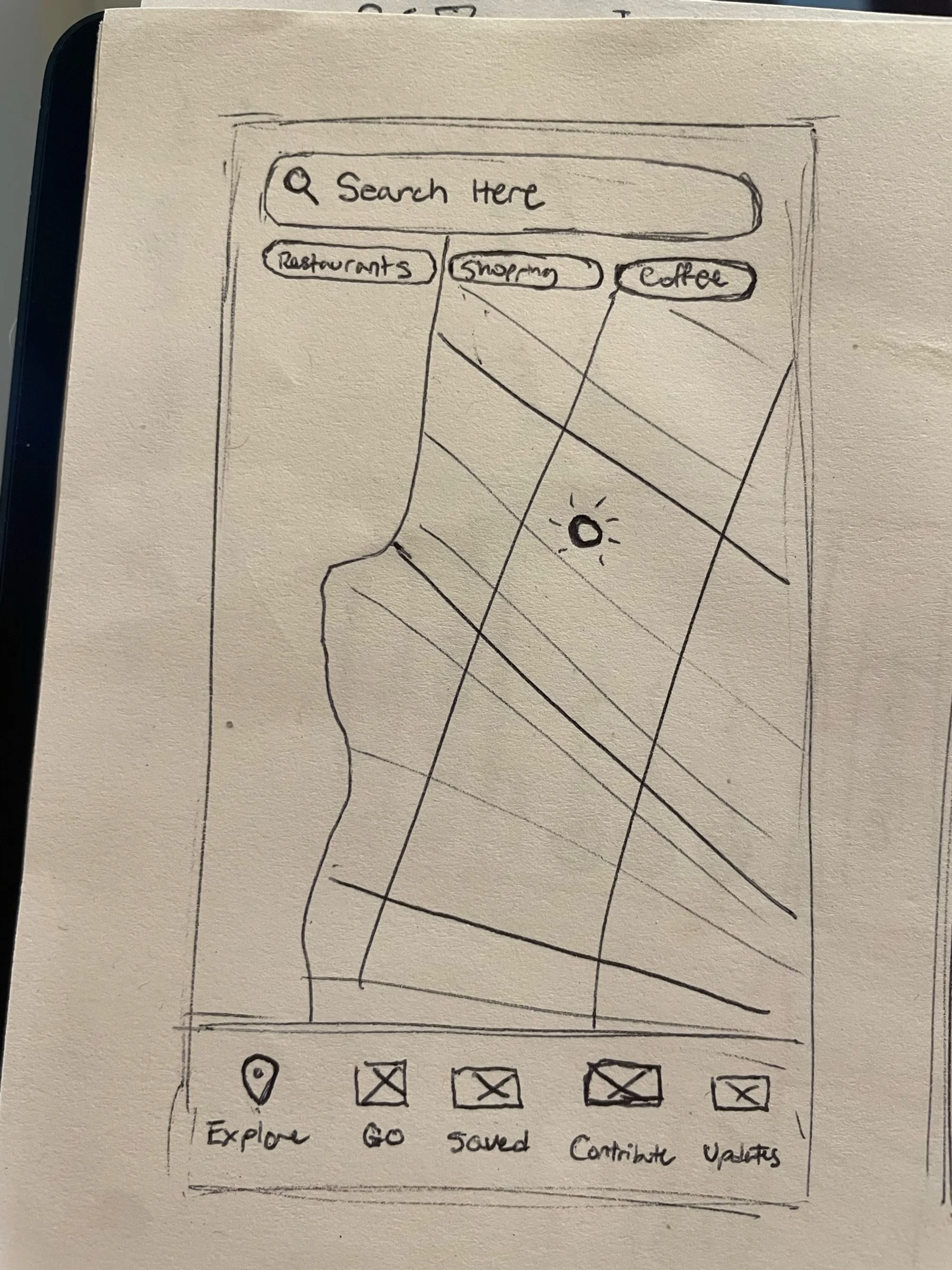
I began the design process by sketching out my first ideas of what screens might look like, including important elements such as a search bar, a discovery section, a home button, and a map.  

Hand-drawn sketch of a mobile map app interface with a search bar, buttons for restaurants, shopping, and coffee, a simplified map with a location pin, and a bottom menu with icons labeled Explore, Go, Saved, Contribute, and Updates.

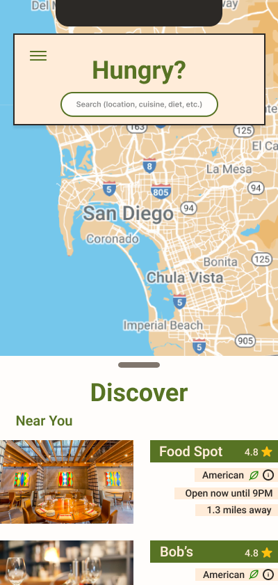
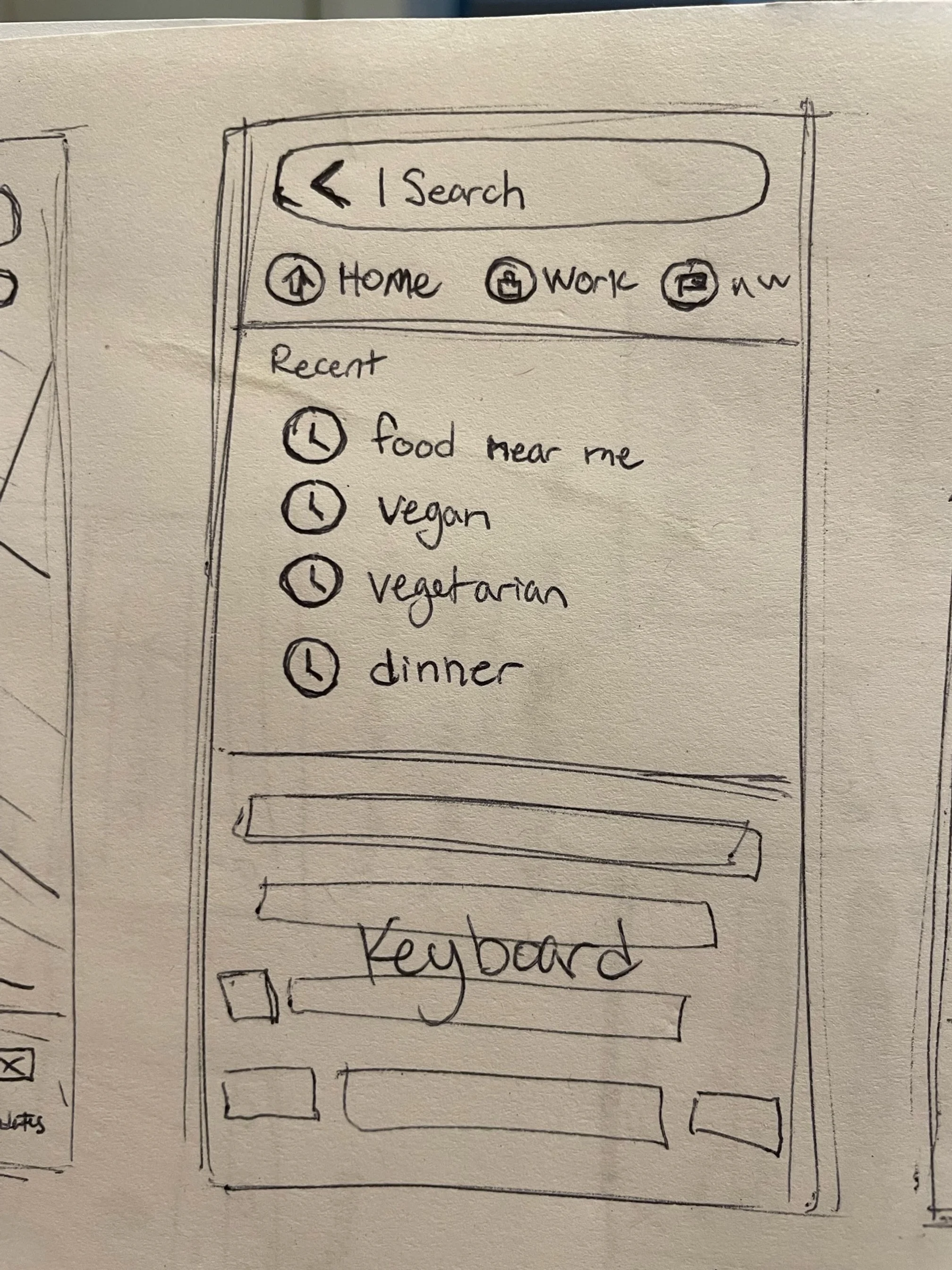
Here you can see an evolution of the Homepage through multiple rounds of user testing.

Map of San Diego area, search bar for food, and list of nearby restaurants including 'Food Spot' and 'Bob's', American cuisine, with ratings and distance details.
Sketch of a mobile search interface with search bar, home and work icons, recent searches including "food near me" and "vegan," and a keyboard illustration below.
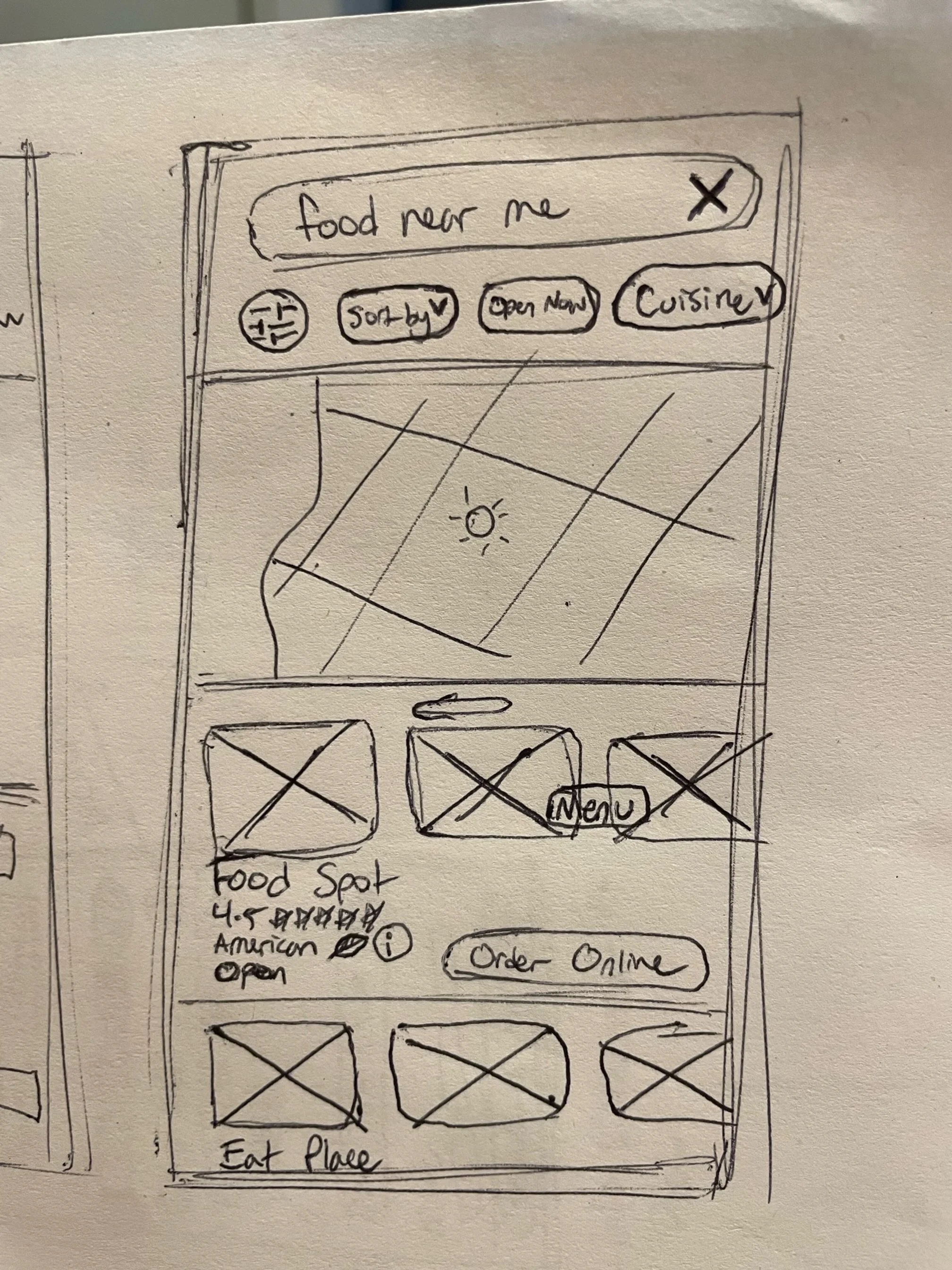
Sketch of a mobile app interface showing a "food near me" search bar, filter options, a map area, and listings for nearby restaurants with buttons for ordering online and viewing menus.

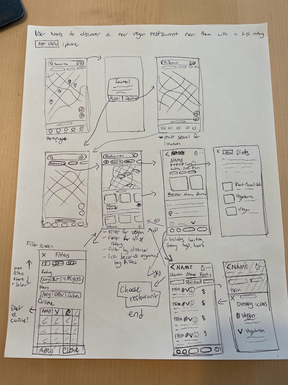
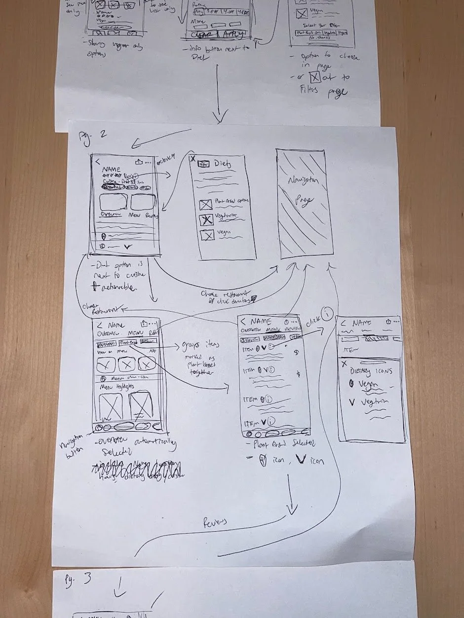
I sketched screens for each step I believed I would need for my red routes, and used them to conduct guerilla testing.

Hand-drawn wireframe for a mobile app showing a user journey to find a nearby vegan restaurant with high ratings, featuring multiple sketched app screens with annotations and arrows.
Mobile app interface mockup with search and filter options for food, including location, cuisine, diet, and ratings, along with a map feature.
Image of hand-drawn UX wireframes for a mobile app on paper, featuring sketches of interface elements like navigation pages, dietary filters, and menu options with annotations and arrows indicating user flow.

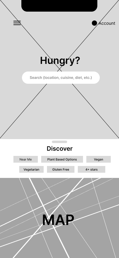
I then converted the revised sketches into wireframes and arranged them into flows representing each red route.

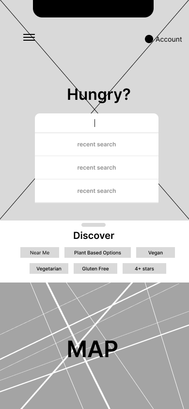
Mobile app mockup showing a food discovery interface with options for recent searches, dietary preferences, and a map feature.
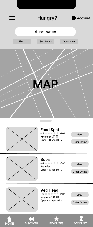
Mobile app interface for food search, including a local map, search bar with 'dinner near me' input, filter options, restaurant listings with ratings, cuisine types, open hours, and buttons for viewing menus or ordering online.

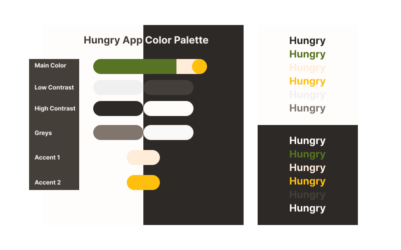
I wanted the app to be as inclusive and welcoming as possible by utilizing

  • a warm and friendly color palette

  • easy to read text

  • a clean design, which I felt the competitors lacked. 

Color palette for a "Hungry App" featuring main, low contrast, high contrast, greys, accent 1, and accent 2 colors. Includes samples of the word "Hungry" in various color combinations on light and dark backgrounds.
Diagrams showing design specifications for icons. Top: Black icon, #2C2926, 14x14 px, line weight 1 px. Middle: Green icons PB, Ve, V, GF, #577324, 24x24 px, 12 size font, line weight 2 px, medium. Bottom: Yellow star icon, #FEBF0F, 20x20 px, corner radius 1 px.
Mobile app interface showing a map of San Diego with restaurant locations marked. Search bar prompts "Hungry?" with options to find local dining spots. Featured restaurant "Food Spot" is highlighted, offering American cuisine, open until 9 PM, and 1.3 miles away. Navigation icons at the bottom include Home, Discover, Search, and Account.
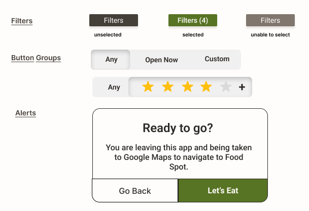
User interface with filter options including selected filters and star ratings, a message about redirecting to Google Maps for navigation, and buttons for 'Go Back' and 'Let's Eat.'
  1. Original Homepage, 2. Updated Homepage, 3. Most Recent Iteration

Pain Points and Learning Experiences 

  • I learned that the amount of information given to a participant before testing can greatly change the outcomes of the test.

  • The way tasks during the test are worded changed how the participant would try to complete them.

Design pain points included size of text and buttons, lack of necessary buttons, confusing or dense language about diets, and misalignment of text and elements. Reports were written after each session of testing to ensure these issues were addressed in order of priority and effort necessary.

The Future of Hungry App 

  • User testing

  • Iterations on content organization

  • Improved aesthetics

  • Collaboration with developers to create a live product