Chuzu
Chuzu is a Toronto-based startup whose goal is to provide a rideshare platform with a mission of giving back to the community in the form of donations toward city infrastructure.
My Role
UX Design
UX Research
Time
4 Week Internship
The Goal
With only a 4 week timeframe to turn Chuzu’s brand requirement into testable screens for the future product, we broke the project down into three main parts. Each designer on our team was assigned one leg of the project to take ownership of, which meant acting as a project manager, delegating tasks to others on the team, and presenting their piece to the founders.
Logo and Style Guide
Design System
Wireframes and High Fidelity Mockups
I lead the Wireframing and High Fidelity Mockup leg of the project.
Negotiation
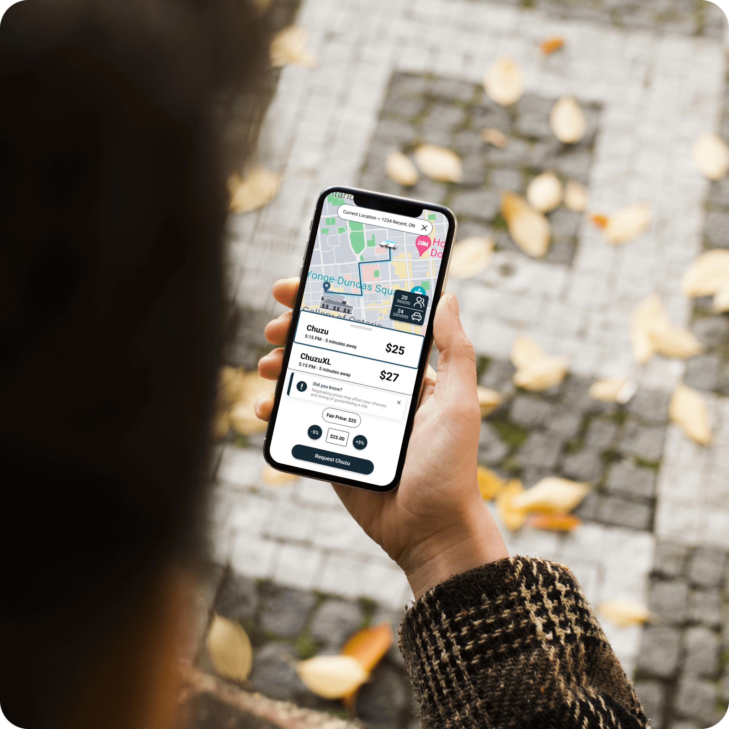
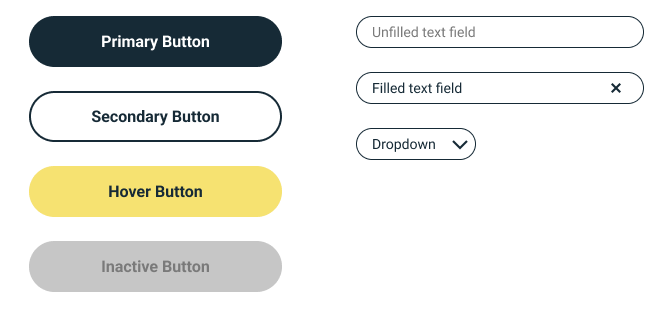
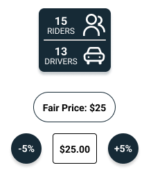
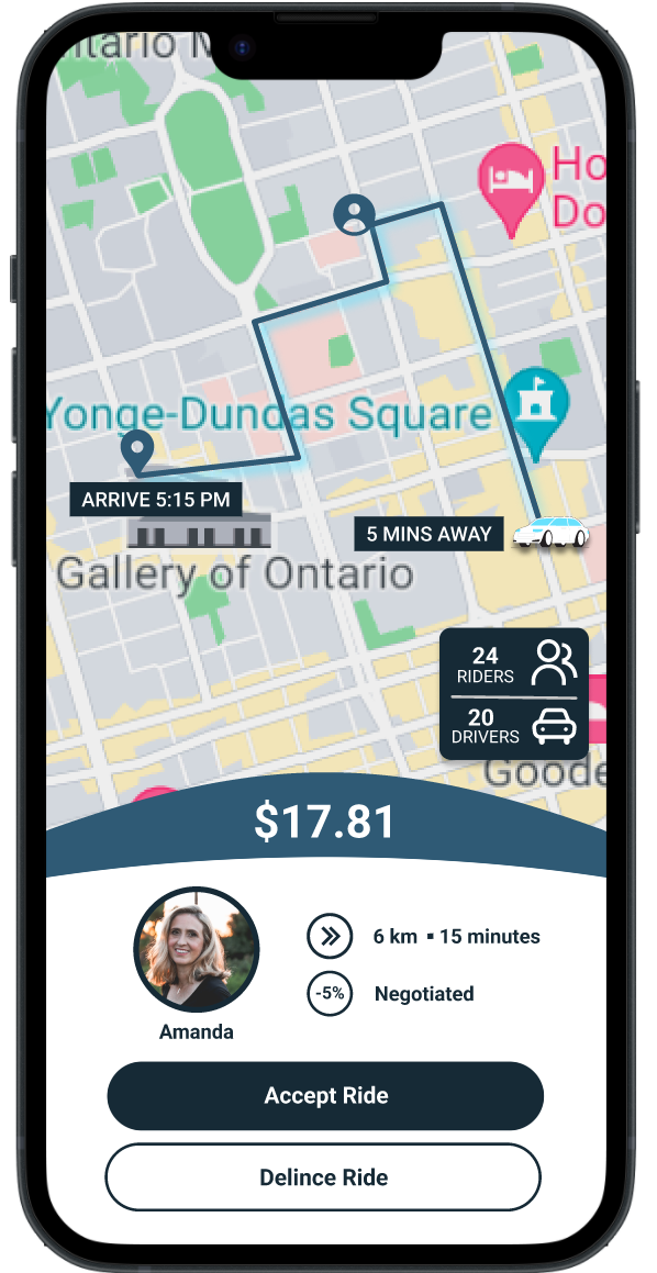
I contributed buttons, forms, a rider/driver live count, and a negotiation element to the Design System.
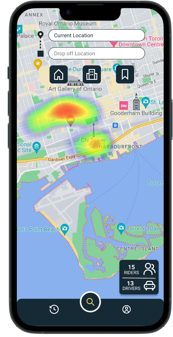
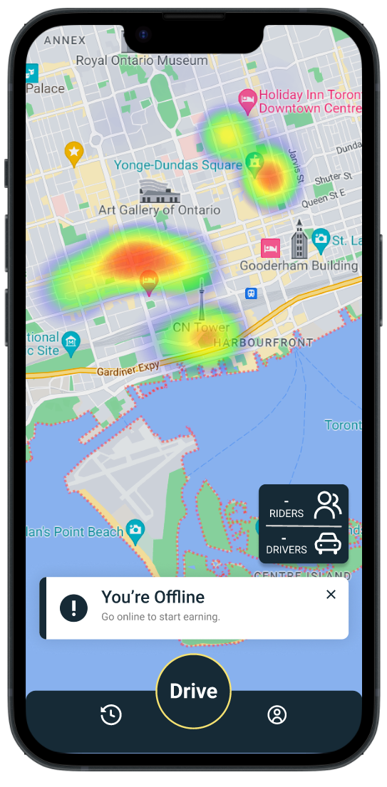
Based on the client’s desire to include a rider/driver live count on the map screen, I explored the value and challenges this element might bring to the product. For instance, it might help users better understand the fluctuation of price based on supply and demand, but it might also create unnecessary competition between drivers.
I decided to create the element in the form of a ratio to promote the notion of supply and demand, as you can see here. The element’s effects on the user would be explored during the testing phase.
Another important element I designed for was the negotiation tool. The negotiation tool was a point of contention between the design team and founders.
Later in the case study, you can learn about the outcome of the negotiation function after testing.
-
This tool was an idea the founders were very attached to. They felt it would provide riders and drivers with pricing options which would hypothetically give them more ownership over their experience. On the design team, we felt the function would create confusion and unnecessary cognitive load for both riders and drivers, and may even create a dangerous situation in the case of drivers attempting to negotiate the price of the ride while operating a vehicle.
On the design team, we felt that:
Negotiation is time consuming
The concept is confusing and creates unnecessary cognitive load
It could be dangerous if drivers are trying to negotiate while operating their vehicle
Overall, we felt the cons outweighed the pros, and this element being my responsibility, I held a meeting to discuss our options. I came prepared with clarifying questions, data from users I interviewed which supported my assumption, the as well as alternatives to the tool which might be more effective.
In the end - the founders felt really strongly that the tool would help the product stand out, so I designed and codified it into the Design System.
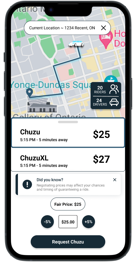
Through many iterations, the negotiation element I designed allows the user to negotiate by 5% in either direction, essentially placing a bid to the driver, who can either accept or reject the offer, rather than creating a long back-and-forth negotiation between rider and driver. This simplifies the action on both ends of the user base as much as possible.
Primary Flows
I took a leadership role for the remainder of the project by organizing and dispersing the responsibilities for building wireframes. Tasks were completed in this order.
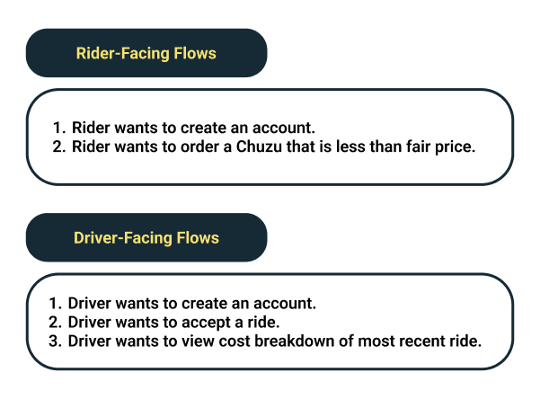
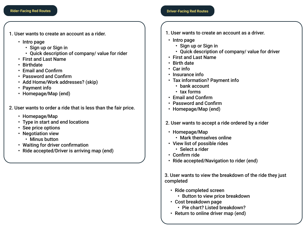
I conducted a brainstorming session for the design team on primary flows (our team used the term “red routes”) we would need to design for both for the driver and rider-facing apps. We agreed on the following flows in the form of user stories:
2. I broke down each flow into essential screens and elements based on user needs to expedite and focus the design process.
3. Flows were dispersed to team members. I took on Flow 2 for both the driver and rider apps.
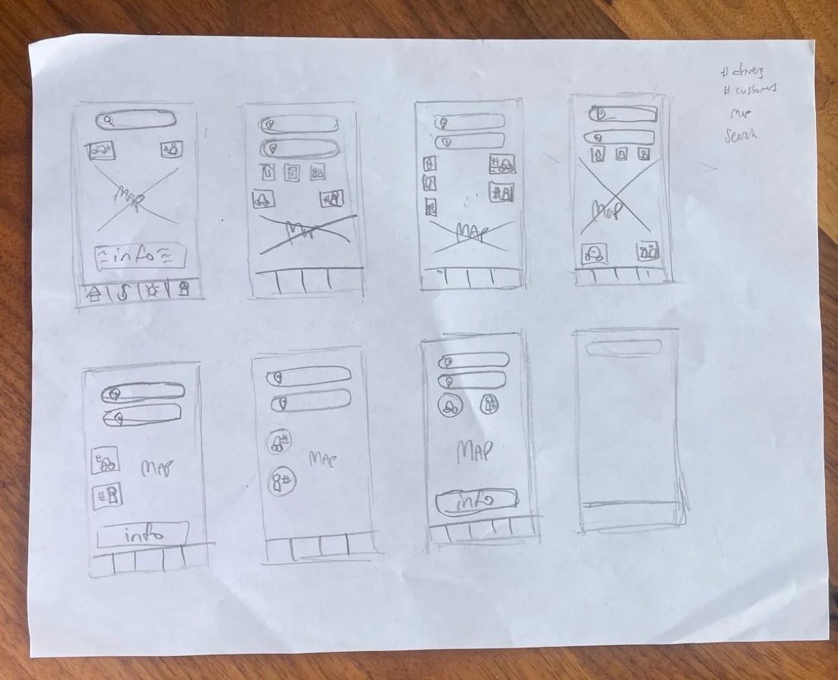
4. I conducted a Crazy 8 exercise for the Homepage/Map Screen that would be used in most of the red routes. This created a solid foundation for the team to create cohesive designs in our wireframes.
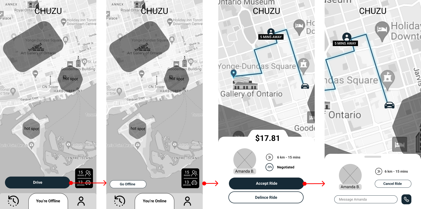
5. I designed grayscale wireframes and arranged them into flows for the client to easily understand.
Rider-Facing Flow
Driver-Facing Flow
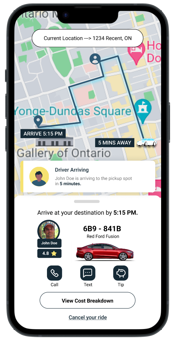
6. A few key screens from each flow were built into the first iteration of high fidelity mockups based on the style guide. This was done so that the client would have something tangible to show investors while testing is being done on the wireframes.
Now that the first version of our HiFi screens were done, I wanted to get some feedback from potential users.
The most common feedback I received sounded was in regards to the negotiation function. Users found it confusing, especially the 5% increment, and felt that they were in some way either cheating the driver out of money, or being cheated themselves. I went back and designed another solution that I hoped would be more familiar and intuitive, while still giving riders pricing options.
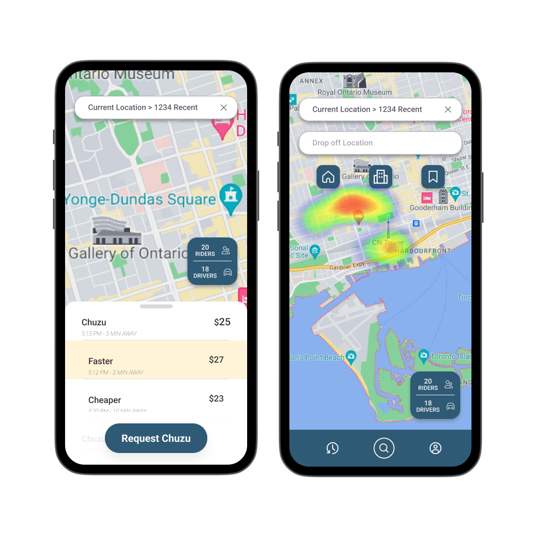
In addition to the new solution, I also updated the design system to something that is simple and reliable in order to quickly iterate new HiFi solutions. You can find examples of the new screens and price selection solution below.
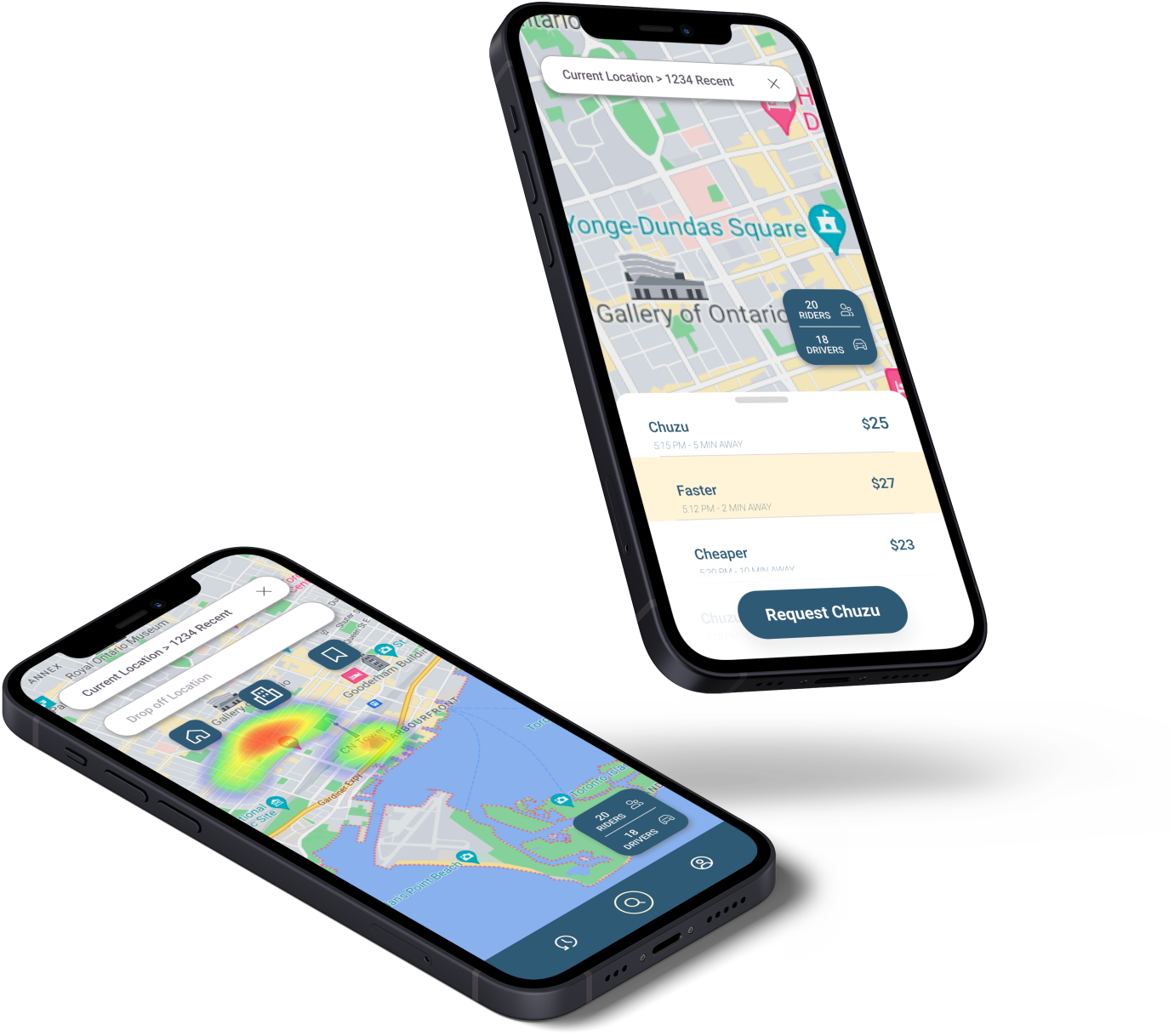
Through AB testing, I learned that users much prefer an option like the solution above. The most important changes I made here are listing out all options with a one-word description of the option. In this case, a user can see that a Chuzu that will arrive in 2 minutes costs a bit more, and a less expensive Chuzu might take longer. This negates the need for the pop up in the first solution that describes the purpose of the negotiation function, and keeps the user from having to do more math than necessary. Test participants also mentioned that the new solution feels sleeker, less confusing, and more inviting.
What I Learned
Iterating solutions within project contstraints
Balancing both the user needs and the client needs
Communicating the importance of the design process to the client
Taking on some project management responsibilities in addition to my design responsibilities on a small team
The Future of Chuzu
Next steps I would take if I were to continue working on this project:
Continue iterating on the pricing/negotiation tool to meet both client and user needs as best as possible
Advocating for more user research
Creating a clickable prototype of the MVP for usability testing
Weighing the importance of simplicity vs novelty for the user experience and interest of investors and stakeholders
