UX Design Case Study
Customizable Onboarding Checklist
Redesigning the customizable onboarding feature of an AI-powered knowledge base for a B2B client.
UI/UX Design | B2B | SaaS | Design Systems | Cross-Functional Teamwork
The Problem
Customizable onboarding feature was hard to navigate, visually overwhelming, and the organizational structure could not house all editable fields.
The Goal
Redesign the customizable onboarding checklist to have an intuitive organizational layout and clean interface to allow the company to bring this feature to market.
The Product: The Kbee
The Kbee is a B2B software with features including an internal knowledge base that uses generative AI to produce company specific articles, as well as a customizable internal onboarding platform.
I was brought on to improve user experience and help Abtech meet their business goals of bringing this new product to market — but the team didn’t know where to start. Luckily, I did.
Here was my game plan:
Challenges
Like any project, there were challenges that would need to be worked around along the way.
Discover
Users
Who are they?
What are their goals?
What data or feedback do we have available?
Audit
Does this product meet Usability Heuristics?
Does this product meet accessibility standards (WCAG)?
How do cognitive load and readability affect the experience of this product?
Research
What can I learn from our users?
Who are our competitors?
What are our competitors doing that works, or doesn’t?
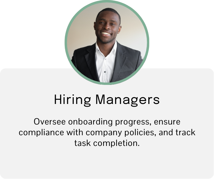
The Users
The Audit
The checklist needed a better design - but the team was unsure of what needed to change. I conducted an audit based on UX and accessibility principles, and made recommendations based on what I found.
Below is an example from the audit:
Research
There had never been quantitative user data collected for this product, and with a tight budget and timeline, there was very little time for user research. Still, I believe the best place to start a project is by doing some research — both by speaking with current users and completing a competitive analysis of similar products. I needed to learn more about:
-
To be honest, not much. There had never been user research done before on this product.
I did have the ability to speak with users within the company, and their feedback would be key to defining pain points.
-
Being short on time and resources, I spoke mainly to users of this software within the company. The main issues seemed to be confusing or misleading text, intrusive pop-ups, and distracting animated UI elements.
-
As it turns out, Abtech was not the only company struggling to properly organize complex, customizable lists. Because of this, I decided to turn to companies outside of the onboarding space. I discovered a couple of products that were really easy to use and understand — so I took notes to hopefully incorporate in my next steps.
Define
Ideate
Iteration 1
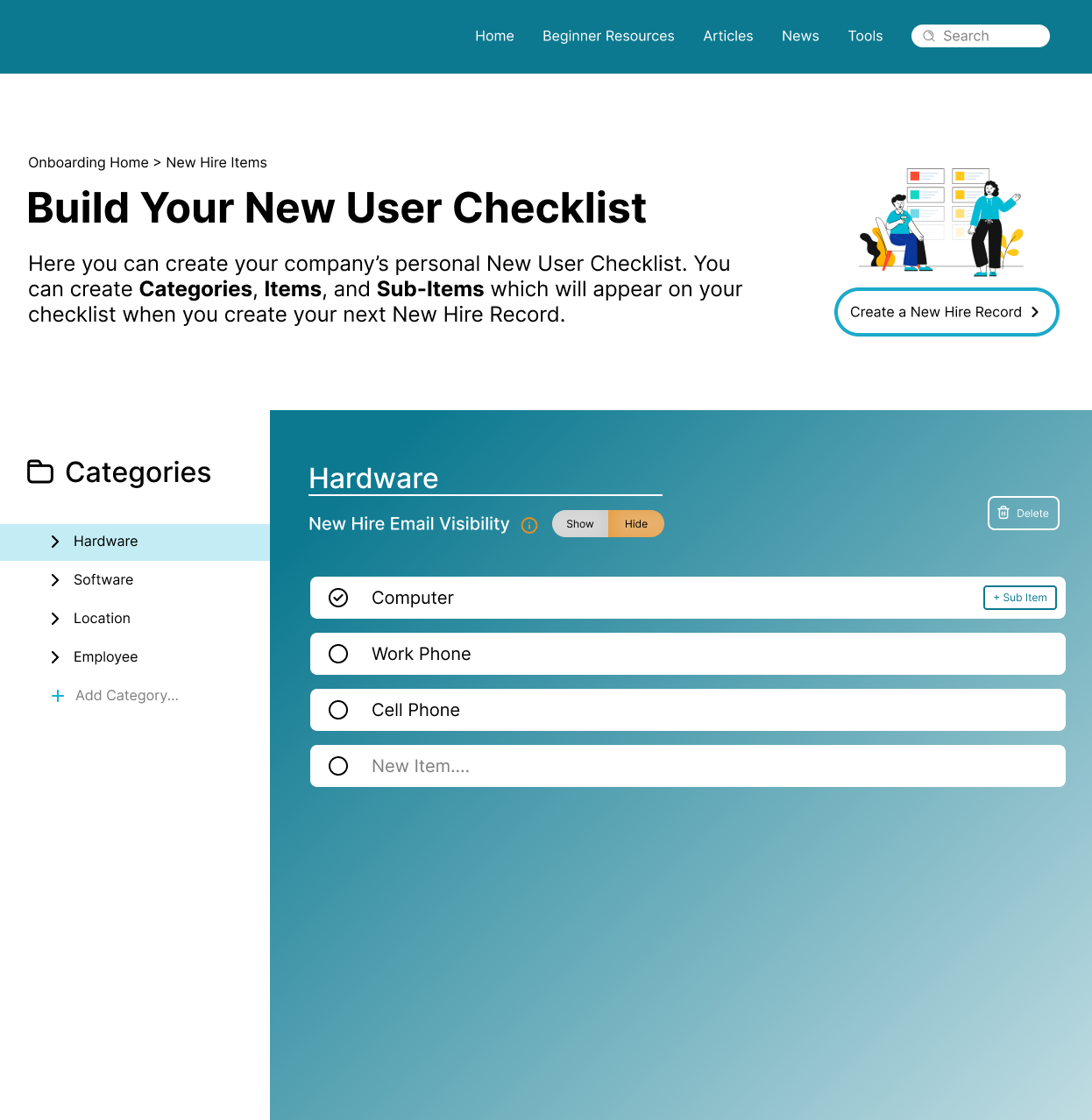
For my first iteration of this design, I prioritized a clean, non-distracting layout without compromising brand personality. I aimed to remove the pop-up element completely, because when a user is building a new list from scratch, or editing many Categories and Items at once, it can quickly become confusing to have to open a new pop up each time.
Here’s how it turned out
1
2
3
4
Feedback and Revisions
Iteration 1 was received extremely well as an improvement on the original page design. The next step towards a better product was including many of the more intricate back-end functions in an easy to understand and visually appealing front-end design.
Here are screenshots of the backend:
Back-end Checklist
Back-end Pop-up
Iteration 2
Now that I had a full grasp of all of the forms and options that needed to be included in this checklist, I could see that the layout I had chosen for Iteration 1 was going to quickly become crowded and difficult to work with. For my next iteration, I decided to try another layout I found worked well in my research -
a full screen (aka split-screen) layout.
1
2
3
4
Design
Design System
Now that a style had been established, I built out the basic design system to apply to the future of this and other Abtech Technologies products.
Conclusion
Iteration 2 was presented to the team, built out, and shipped as the latest version of the product at the end of my contract. This research-backed solution resulted in:
A rise in sales and customer acquisition.
Increased operational efficiency and competitive advantage.
and most importantly, a product Bob could use with ease.
Thanks for reading! For more information:


